OncoK9 Brand Refresh
OncoK9 Brand Refresh
PetDx is a molecular diagnostics company dedicated to unleashing the power of genomics to improve pet health. PetDx's flagship product, OncoK9®, enables veterinarians to detect cancer in dogs with a simple blood draw.
Objective
Directed a brand refresh initiative, overseeing competitive market research, iterative concept development, and testing.
Scope of Work
Brand Strategy
Project Management
Tradeshow Design
Role
Marketing Brand Manager
Learnings from Industry Brands
After evaluating a multitude of brands in the veterinary and liquid biopsy industry,* we learned that:
No one has successfully owned fuchsia as their main brand color, highlighting an opportunity for our brand to be correlated with fuchsia.
These brands all heavily rely on emotional marketing by using lifestyle images and compelling copy, aligning with our direction to balance our scientific and emotional aspects of the brand.
*IDEXX, Antech, Zoetis, Volition Veterinary, Embark, Anivive, GRAIL/Galleri, The Farmer’s Dog, Fear Free

Functional & Aspirational Goals
As the company initially focused on its groundbreaking science brought over from the human space to the veterinary industry, the OncoK9 brand was highly scientific and clinical. Over time, there was an opportunity to appeal to the emotional side of veterinarians and empower them to change the canine cancer conversation. The following functional and aspirational goals guided the entire brand refresh journey.

Visual Brand Refresh
Below are two mood boards that capture the essence of OncoK9’s previous branding (left) and its refreshed branding (right). Enhances to color, logo design, and typography and photography styles instill an overall warmth and convey a greater emotional and energetic appeal.
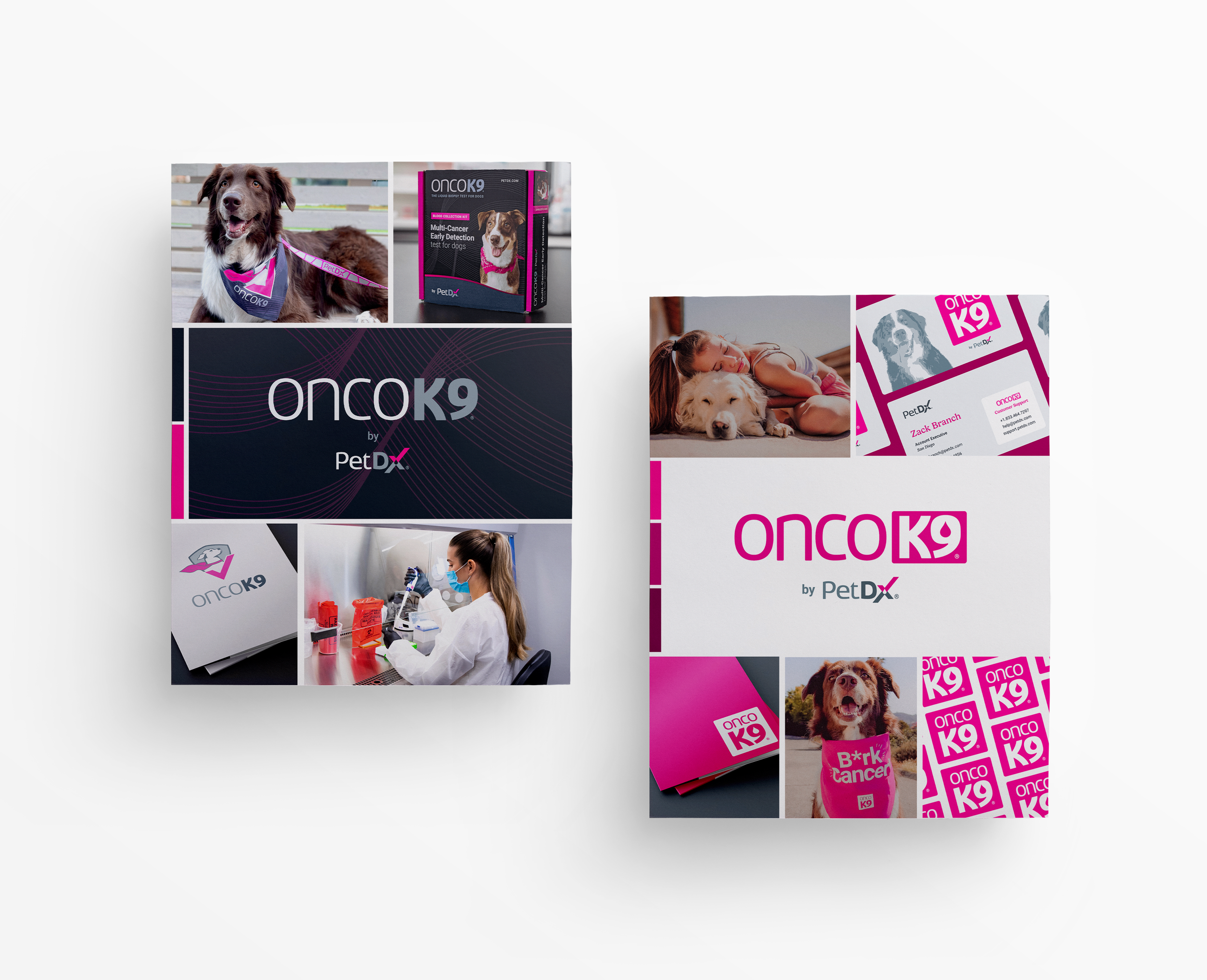
Primary Logo
The new OncoK9 logo displays ‘K9’ in a box, reinforcing the correct pronunciation of ‘onco-canine’.
The boxed ‘K9’, thicker letterforms of ‘Onco’, and monochrome fuchsia color position the logo to appear bolder and more striking than before.
By bringing fuchsia into the logo level, OncoK9 and fuchsia will be strongly associated together over time, aligning with the goal to own fuchsia in the veterinary industry.


Secondary Logo
OncoK9’s secondary logo is a square badge that is intended for use in smaller spaces, for graphic purposes, and overlaying images.
Product Logos
At the logo level, OncoK9®Screen and OncoK9®Dx now share the same monochrome fuchsia OncoK9 logo to strengthen the OncoK9 umbrella brand.


Colors
The brand’s primary color is Fuchsia, accompanied with tints and shades to add design versatility. The greys complement this Fucshia spectrum.
Sky and Lime are secondary colors for OncoK9®Screen and OncoK9®Dx, respectively. They belong to a tetradic color scheme and possess equal luminosity in which one color does not dominate the other color. OncoK9®Screen and OncoK9®Dx are to be seen as equal sub products under the OncoK9® brand.
Typography
The serif typeface, Gelica, was added to the brand’s typography style.
Gelica’s characteristics embody warmth, humble confidence, and a softness that eases the straightforward professionalism of Roboto. Gelica and Roboto work synergistically to strike a healthy balance between emotions and professionalism.


Photography
The brand’s new photography style focuses on capturing real life intimate moments of dogs and the love shared between dogs and pet parents.
With increased fuchsia shadows, added grain, and an overall muted softness, the photo treatment in place mimics analog photography and elicits feelings of nostalgia. The addition of photo-treated lifestyle imagery supports the goal of appealing to veterinarians and pet parents on an emotional level.
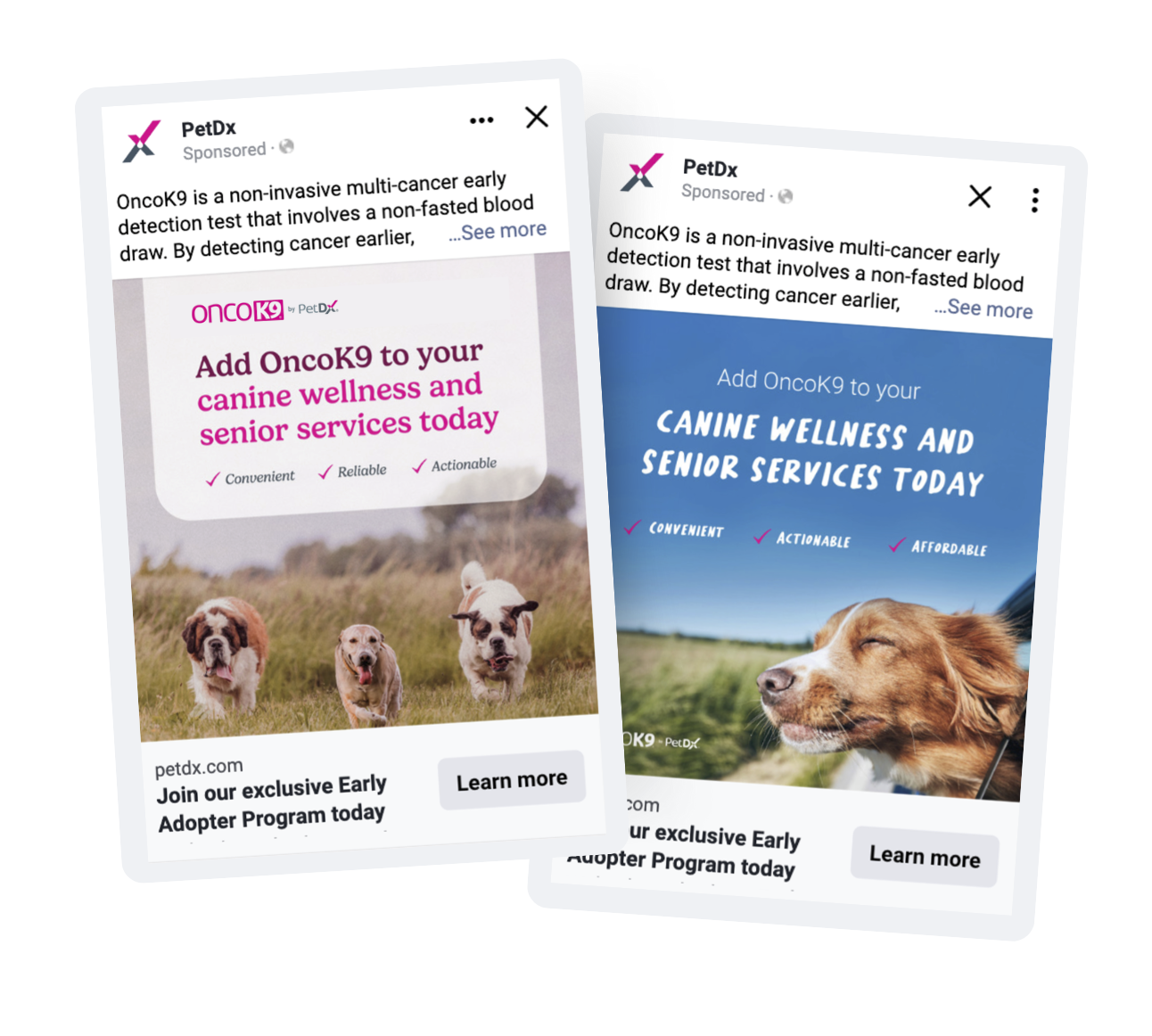
Facebook Ad Testing
We crafted an A/B Facebook ad campaign aimed at lead generation, using different creative to represent both the old and new branding. The refreshed branding ad garnered three times as many lead form submissions compared to its old branding counterpart.

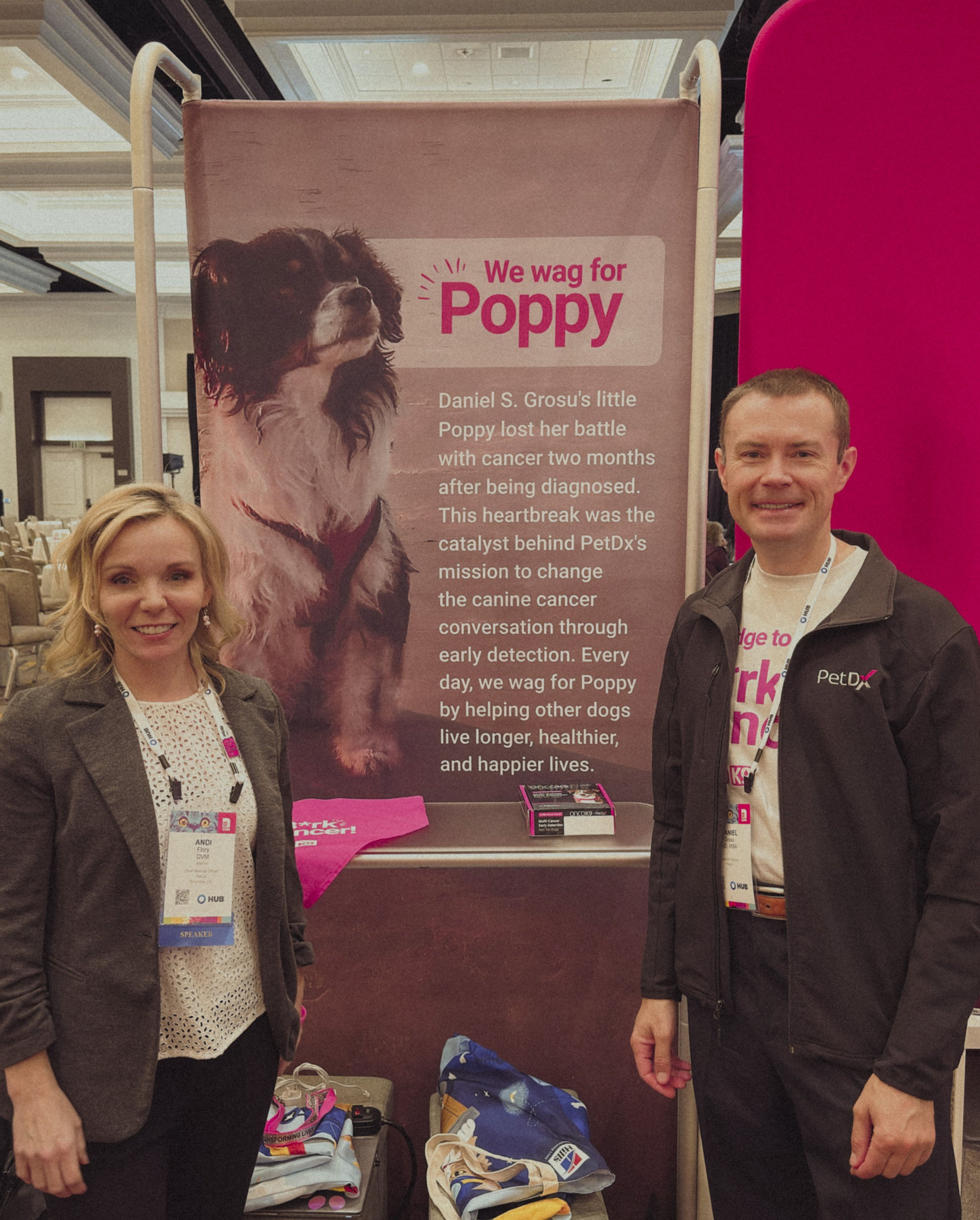
I’m gathering feedback from a veterinarian at the conference about the OncoK9 brand refresh.
Pilot Conference Surveys
We piloted the brand refresh at a local conference and surveyed ten veterinary attendees about the new OncoK9 brand. The majority of feedback was positive, and our specific findings include:
10/10 reacted positively to the overall branding
10/10 pronounced OncoK9 correctly when shown the new OncoK9 logo
8/10 reacted positively to the typography selection, while 2/10 expressed neutral sentiments
8/10 reacted positively to the photography treatment, while 2/10 expressed neutral sentiments
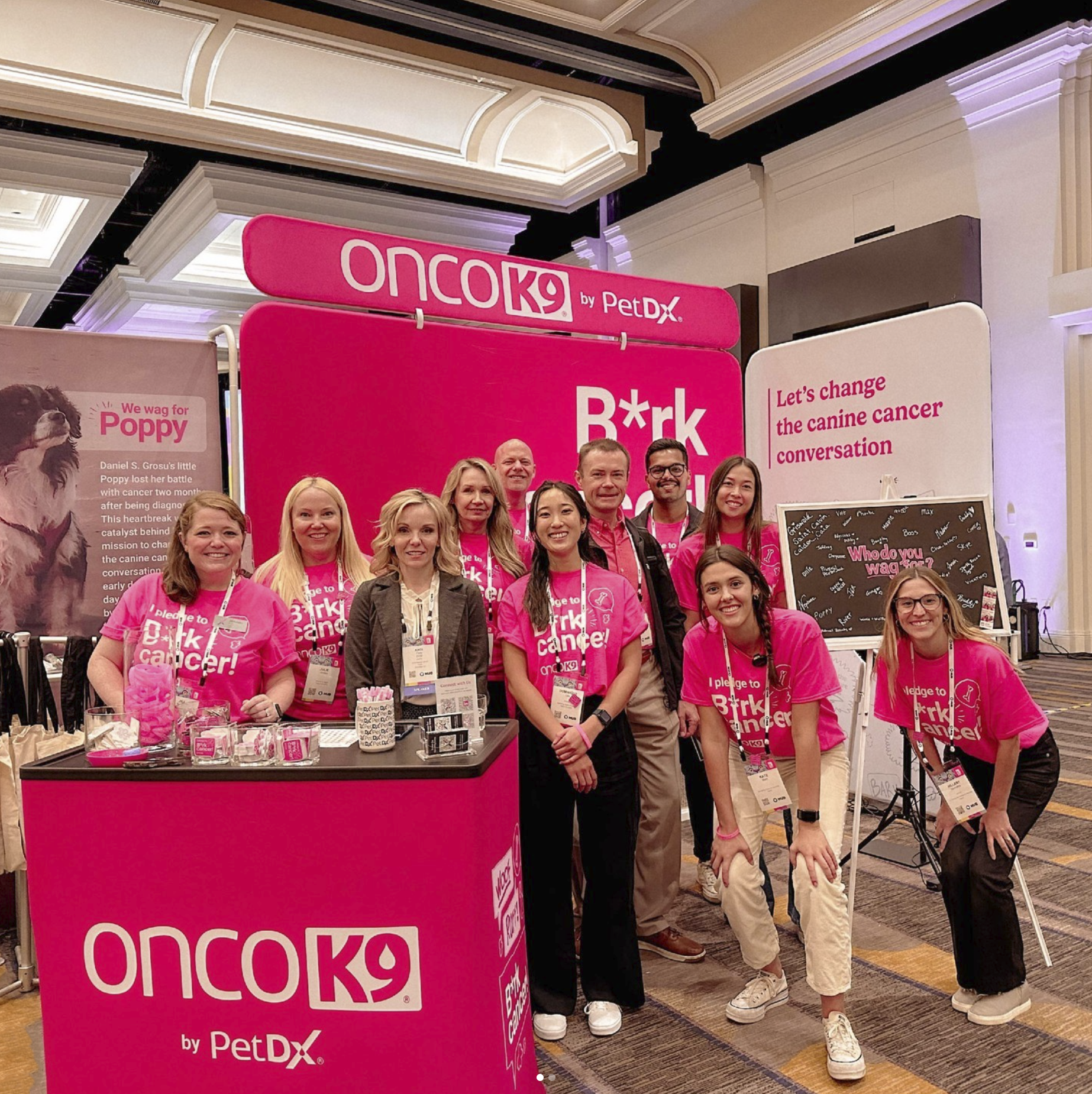
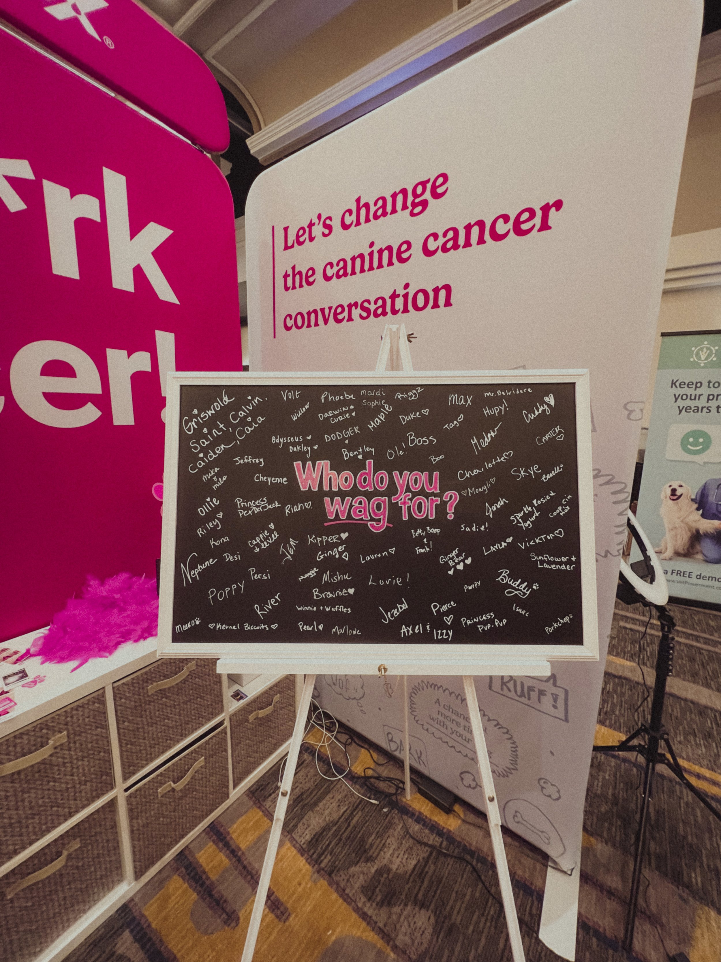
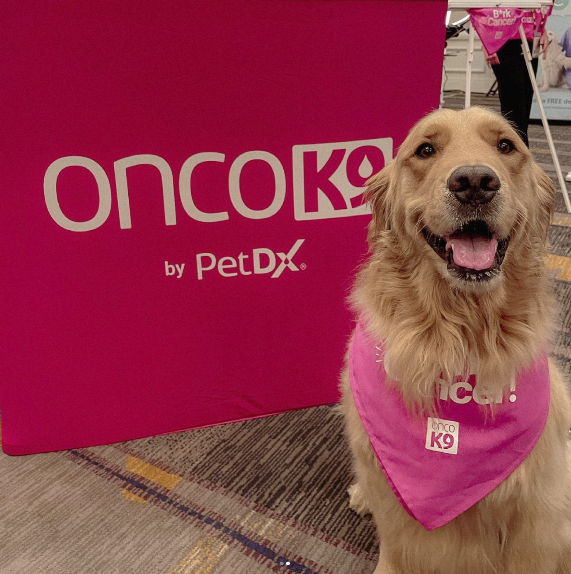
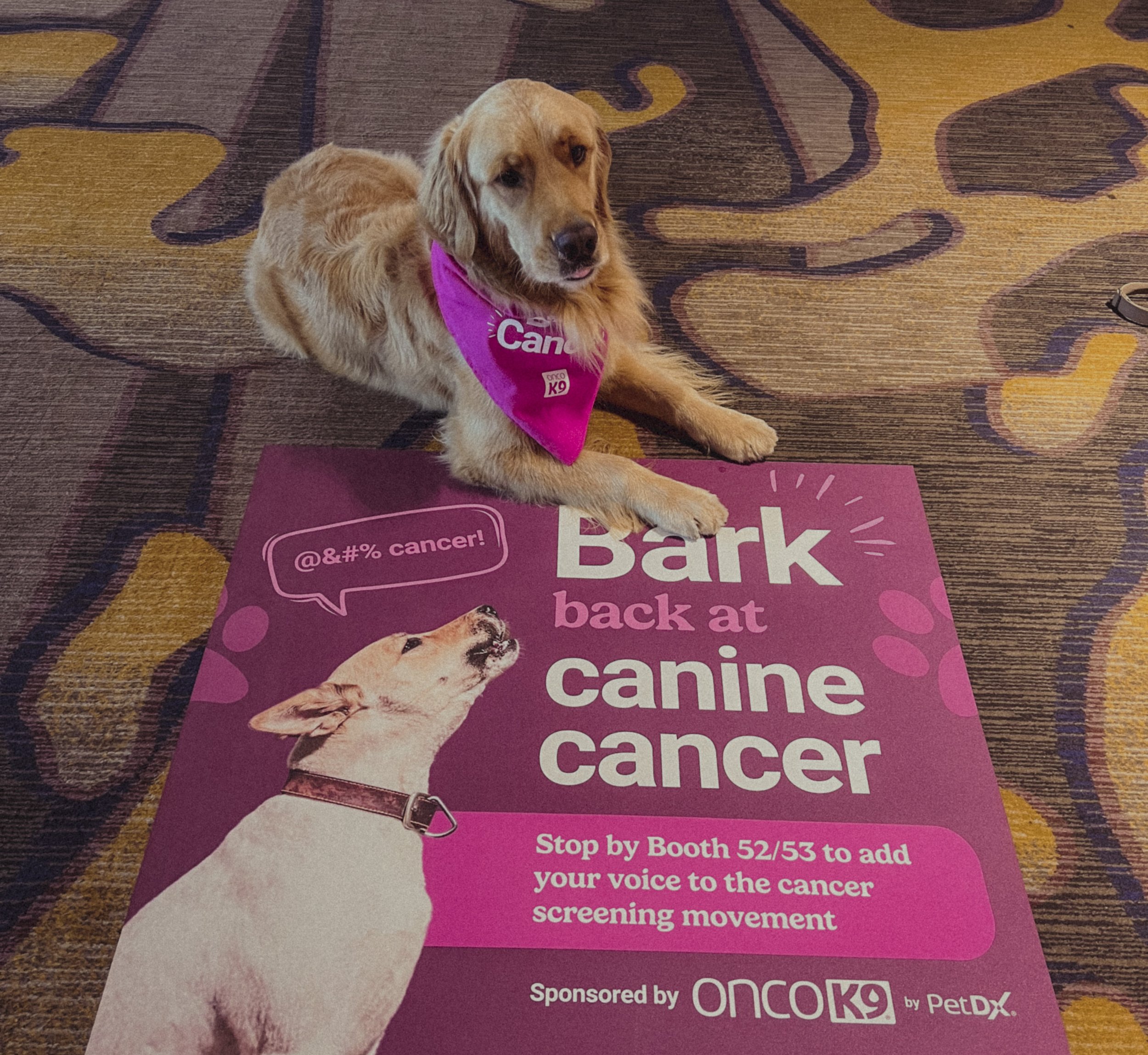
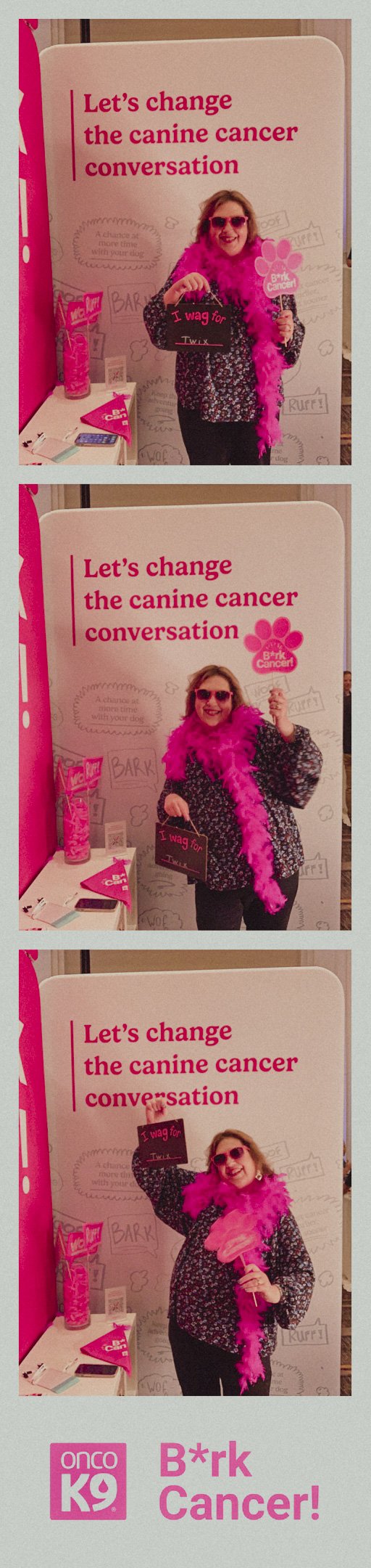
The B*rk Cancer! Experience
One aspirational goal for the brand refresh was to disrupt the industry via visual design, strong messaging, and memorable experiences. We paired the OncoK9 visual refresh with bold and empowering messaging and created a unique conference booth experience.
The idea behind the B*rk Cancer! theme was to change the canine cancer conversation between the industry, veterinarians, and pet parents. While the strong fuchsia booth presence attracted attendees, emotional elements like Poppy’s story or the interactive chalkboard asking veterinarians “Who do you wag for?” resonated the most. Veterinarians shared their own cancer stories with us, opening up discussion to the importance of early cancer detection.